
The Mobile Help Screen Problem Repeated Across Hacksaw Gaming Titles
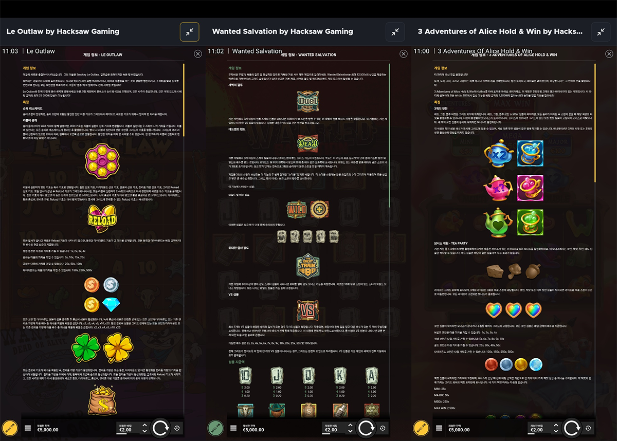
Across several slots, the Korean mobile help screen appears to shrink a shared desktop UI layer into the phone display. The text is tiny, and the menus and controls are not adapted to touch. Even on a large Galaxy S23 Ultra the content is hard to read; on an iPhone 8, using the menu itself is difficult.
The Issue
Across several slots by Hacksaw Gaming, the mobile help screen uses a shared desktop UI layer reduced to fit the phone. The explanatory text is not the only small element. The entire interface, including the section menu and buttons, is so small that players struggle to identify content or navigate to the part they need.
The text is difficult to read even on a large phone, and tapping the menu becomes difficult on a smaller one. This is a failure of the localized mobile help screen as a whole, not an isolated translation or font-size issue.
Analysis
A shared UI makes it easier to maintain help screens across games. But shrinking a desktop layer instead of redesigning it for mobile also shrinks its text, headings, navigation, and touch targets. The information remains on screen while reading and operating it become difficult.
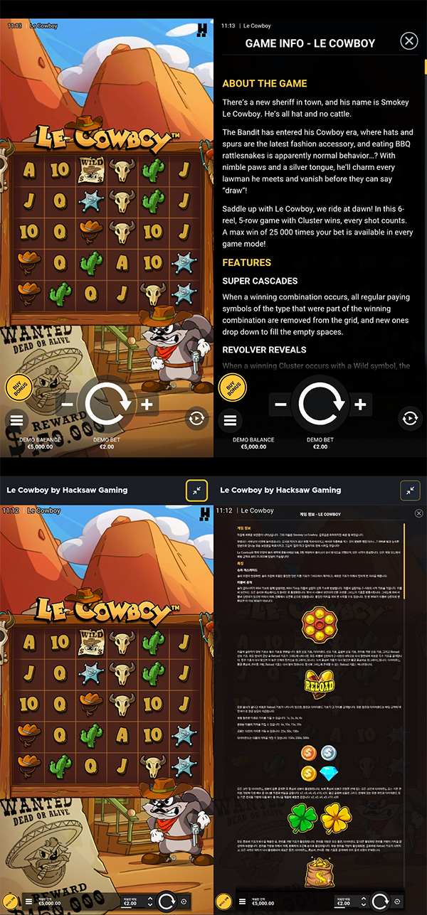
The same pattern appears in several Korean-language games by Hacksaw Gaming. The English mobile version uses a larger, opaque help panel, while the Korean version overlays dense, small content on the game screen. The studio needs to examine how the shared layer and locale-specific interfaces are maintained.
Possible Solutions
Increasing the font alone will not fix the rest of the menu. On mobile, the body must be laid out at a readable size, with touch targets and section navigation designed for a phone. A sufficiently large panel and natural scrolling are better than compressing all content into one view.
Compare the same help section in English and Korean on both desktop and mobile. After revising the shared UI, review the titles that use it together. The same pass can cover usability problems that begin at game entry.
Scope of the Issue
This is not confined to one game. Several of the linked Korean mobile versions show a shared desktop help layer scaled down into the phone display. Along with the tiny text, the menu itself is so small that finding and using content becomes difficult.
The comparison for [Le Cowboy](https://slotwise777.com/en/reviews/le-cowboy-hacksaw-gaming-251111) makes the contrast clear: English uses a large help panel, whereas Korean overlays a much smaller one. Other localized languages were not directly examined, but the same usability failure is likely across other games and languages if they share this localized UI. The scope of the shared mobile layer and locale-specific UI needs review.
Potential Risks
A shared UI failure spreads across games. If players cannot properly read the help text or use its menus across titles, they may judge Hacksaw Gaming’s mobile experience as a whole. A common layer intended to reinforce the brand becomes a repeated weakness.
When the English help screen is readable and operable but the localized version is barely usable, players may feel their market has received an inferior build. The number of supported languages matters less than comparable usability in each one.