
A Localized Entry Screen That Undermines the Game Before Play
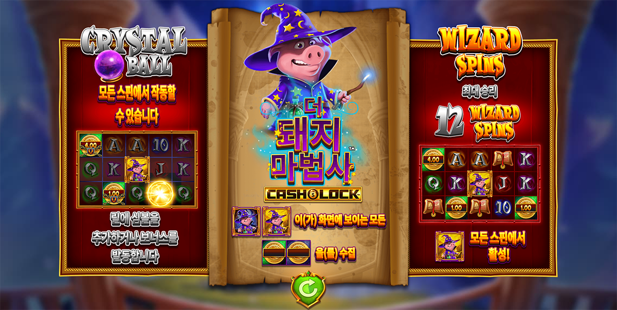
The screen shown before play introduces the game and its main features. In the Korean version of The Pig Wizard Cash Lock, however, the localized title and feature descriptions on both sides are undermined by heavy effects and poorly fitted lettering. A screen meant to build interest instead makes the game less inviting.
The Issue
This example comes from the Korean entry screen of The Pig Wizard Cash Lock by Blueprint Gaming.
The central title has been localized as “더 돼지 마법사.” It sounds awkward as a Korean game title, and “더” can be read as “more” rather than the transliteration of “the.” The broader issue of changing a game logo is covered in our article on localized artwork.
The feature descriptions on either side are the bigger problem here. Thick outlines, shadows, and intense color effects make the Korean lettering crowded and rough. The left-hand phrase “모든 스핀에서 작동할 수 있습니다” is also squeezed horizontally until its letterforms look distorted. The text meant to sell the game’s features becomes hard to take in.
Analysis
Each Hangul syllable block combines consonants and vowels. Heavy effects and horizontal compression close up the space between its strokes, making the letterforms look muddled. Squeezing the phrase on the left does nothing to make the feature more compelling. It looks like Korean copy has been forced into space and effects designed around English.
On a screen shown before play, players should be able to understand the features at a glance. When decoration dominates the message and damages legibility, the screen fails at that job.
Possible Solutions
Instead of squeezing the letters into the existing panels, shorten the Korean copy and redesign the placement of each description. Keep outlines and shadows light enough for the letterforms to remain clear, then check legibility at the size players actually see. If the title is localized, review both how natural the name sounds and how well the new logo fits the original artwork.
If this level of language-specific design and review cannot be maintained, retaining the original artwork is the better choice. On a screen that introduces the game, the quality of localization matters more than the amount of it.
Scope of the Issue
The observed case is this game’s Korean pre-game screen. The central issue is not the mistranslation of a particular word, but the approach of squeezing and decorating local-language text to fit a layout and effects designed for English.
If other localized screens are built the same way, Japanese and Chinese text may also become crowded or hard to read. Titles, feature descriptions, buttons, and other elements meant to be read quickly need language-by-language visual review.
Potential Risks
Players see this screen before they begin. An awkward title and rough-looking feature descriptions can sharply lower their expectations before they have even tried the game. For local players, the screen comes close to discouraging the very play it is meant to invite.
Reworking screens for each language takes time and money, and every correction adds maintenance across artwork and localized builds. If that effort produces something less appealing than the original, localization has defeated its own purpose. Commit to a fully designed and reviewed local version, or preserve the quality of the original. This screen calls for a clear choice.